
Working with HTML and XSL Templates
WebPal Structure
The WebPal Cloud Server is a business solution for secure, private, and powerful web content management, document storage and online collaboration.
WebPal Cloud Server allows users to manage web content, documents, share files, and host big data, all in one secure web-based interface.
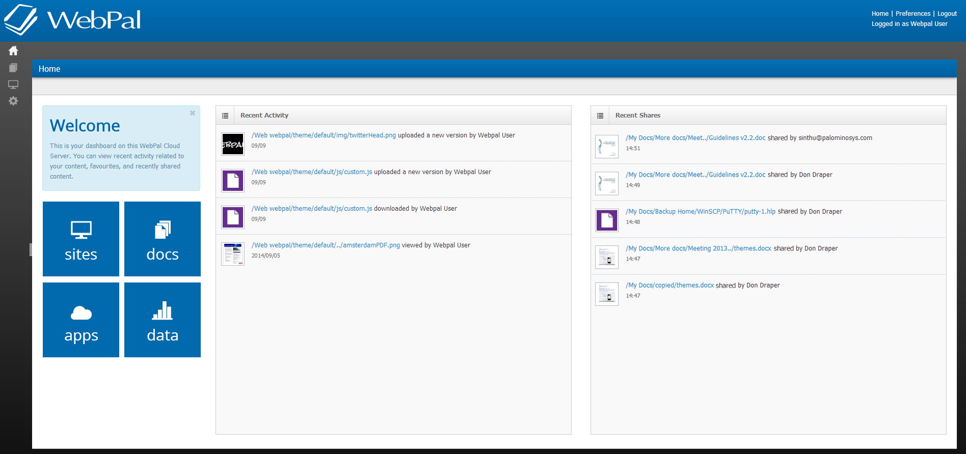
WebPal 3 Dashboard
WebPal 3 consists of the following Components:
- Sites: Manage multiple web sites, micro sites and landing pages on a single server. WebPal offers all standard features of an Enterprise Content Management System.
- Docs: Manage and share documents, back up work stations and mobile devices, and empower your team with online collaboration.
- Apps: Every business runs differently and the online applications need to reflect that. WebPal offers a framework to build custom business applications, using open technologies.
- Data: WebPal hosts business data in a secure and powerful environment. Browse, filter, manage and export data bases, and connect them to your business applications.
Docs
WebPal Docs is plays an integral role in template development as the Docs section maintains all web related documents, such as stylesheets, JavaSrcipt and any additional plugins that are required for a web’s look and feel.
Path: Web webname > theme > default
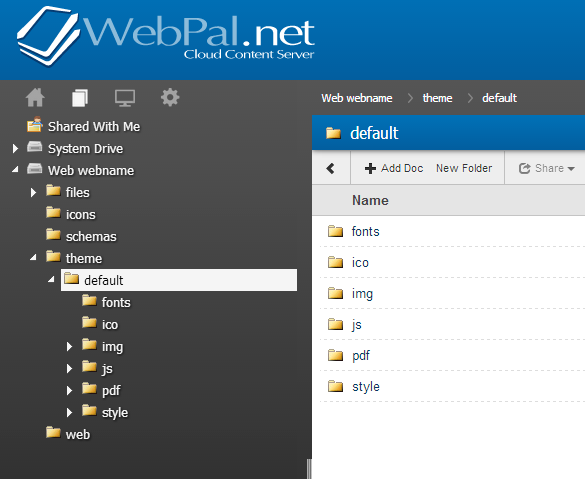
In order to edit any of the web-related documents, select the file that requires revision, then download the document and modify it using an editor of choice. Once complete, upload the document back into the designated directory and replace the old file with the new version.
There is a version control mechanism for each document. When uploading a new document version it is recommended to select the “upload new version” function from the action menu so that you may revert back at any time to a previous configuration.
Sites
The Sites component, identified by a monitor icon in the toolbar, is where content for website, microsites and landing pages are managed. It also includes design templates and custom plugin extensions associated with your web.
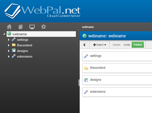
WebPal Sites maintain 4 separate top-level components :
- Settings: These are global settings that relate to the web as a whole; such as publishing destinations, DB connectors, analytics tracking and much more.
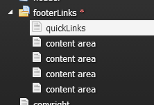
- Thecontent: This is the area of the backend where the actual web content is managed through our WYSIWYG editor and intuitive node interfaces. Each folder icon in the tree structure represents a unique web page and will house all nodes related to the page including carousels, lists and news feeds to name a few. Global content, such as header and footer information, can be found under the chapter “Common Content”.
- Designs: Designs are where all html templates can be found, access to this area is usually reserved for developers and users with strong HTML and CSS knowledge.
- Extensions: XSL templates to make the website editing simple.
In order to work with XSL, we recommend walking through the following tutorial.
XSL tutorial: http://www.w3schools.com/xsl/
Sites > Extensions
The Extensions node is where all XSL templates are held. The purpose of XSL templates is to improve efficiency when editing designs, ensuring global updates are possible across all designs rather than editing each one individually. After creating templates in XSL, each of them must be included within each design via XSL calls in order to render them.
Creating Simple Templates in Extensions
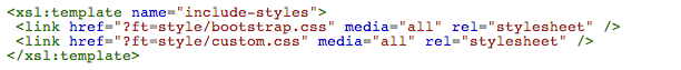
For any websites under Extensions > meta, XSL templates are available for including stylesheet files and JavaScript files. Below is a screenshot of a XSL template that is created just to include stylesheets, which are located under Docs (as stated above). As Docs and Sites are integrated together, there is a special root that you must use to include for any files from Docs, for example webname > theme > default > style > bootstrap.css
Special root: ?ft=
You are free to label your templates with names that are intuitive to you and your team, it must be consistent with what you will be including in design templates, which is covered under Designs.
Sites > Designs
When creating a new template in the designs node, you must ensure the design contains the following XSL stylesheet wrapper:
<!-- design goes here -->

Then under the <head> section, add your XSL templates to include your CSS stylesheet(s) (see screenshot below) and Meta tags.
At the bottom of the <body> section, include your JavaScript files so the webpage will load faster:

The Following are a few examples of how you can make use of XSL templates:
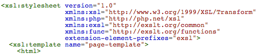
Example 1: When you have your design structured, you will want to specifically include one of the content areas from a chapter. For example, in an Index design, which is specifically for the home page, you might want to render content that is set to show-in “related1”. After applying the XSL your template will render anything in home chapter that has an attribute labeled show-in=related1:

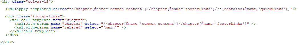
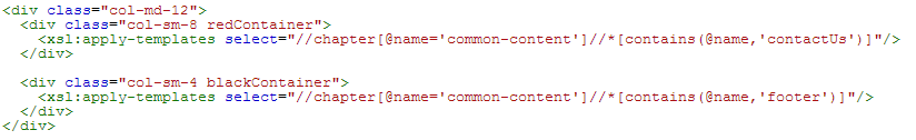
Example 2: Some components in an index design will be duplicated within additional inner page templates. In order to update these components efficiently, you should include those components in the ‘common-content’ chapter, give each component a unique name, and then apply them in each design using the following:

Example 3: When you want to display content in a table, think ahead to how this content will respond to alternate screen resolutions. Do you want the column widths to decrease in size and wrap content or would you prefer each column to stack on top of each other when the screen size changes? Always try and plan ahead about how you intend for the site to respond before implementing markup.

In order to apply responsive attributes to each column;
1.Create an XSL template in “extensions” with responsive classes separating each attribute into separate columns
2.Create the content for each column separately with the same “show-in attribute”. For example, if there are 4 columns and if “show-in=” is set to “main”, then create 4 different content areas in the page folder, and apply “show-in=main “ to all 4 content areas.
3.then in the design, apply your XSL template with “show-in=main”.
Thinking ahead for each possible scenario is the key to building responsive and easy to manage template designs.
Examples of Planning Ahead:
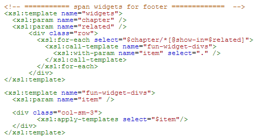
Example 1: Try to refrain from using tables within content areas whenever possible. The following footer content could theoretically be implemented in one related field using a table within the WYSIWYG editor. However, how will this content stack when scaled down?

Solution: Separate the content using divs and identify different content areas just like the following:
Sites > Content/Chapters
Pages in a web instance are structured in 'thecontent' directory, and each page includes content in some capacity whether it is a carousel, staff list, news list, html nodes or static text and images.
The ordering of each chapter is directly related to the frontend navigation presented to the user. Frontend navigation is based on the tree structure located within “thecontent” and uses the title of each chapter as headings for navigation items.
Some websites maintain custom and/or dynamic navigation structures; in this case there would be a custom html snippet with corresponding links that are manually mapped to designated pages/directories. Even though the ordering doesn't have an effect on navigation in this specific use case, it’s always best-practice to try and keep pages ordered in sequence.
Additional Notes:
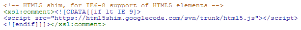
- To include any conditional styling, such as IE6-8, use the following format:
- Do not edit a file associated with plug-ins, instead overwrite it in a custom css or js (ex. Bootstrap, DatePicker, flexslider)
- If you require tables to display your content and are planning to maintain responsive designs, make sure the widths of the tables are set to 100%.
- When using images or fonts within a CSS or JS file make sure to link them properly to the designated directory in Docs.